BLAZING PINE BRAND STRATEGY, IDENTITY & WEBSITE RE-DESIGN
Blazing Pine
Brand Strategy, Visual Identity & Website Re-Design
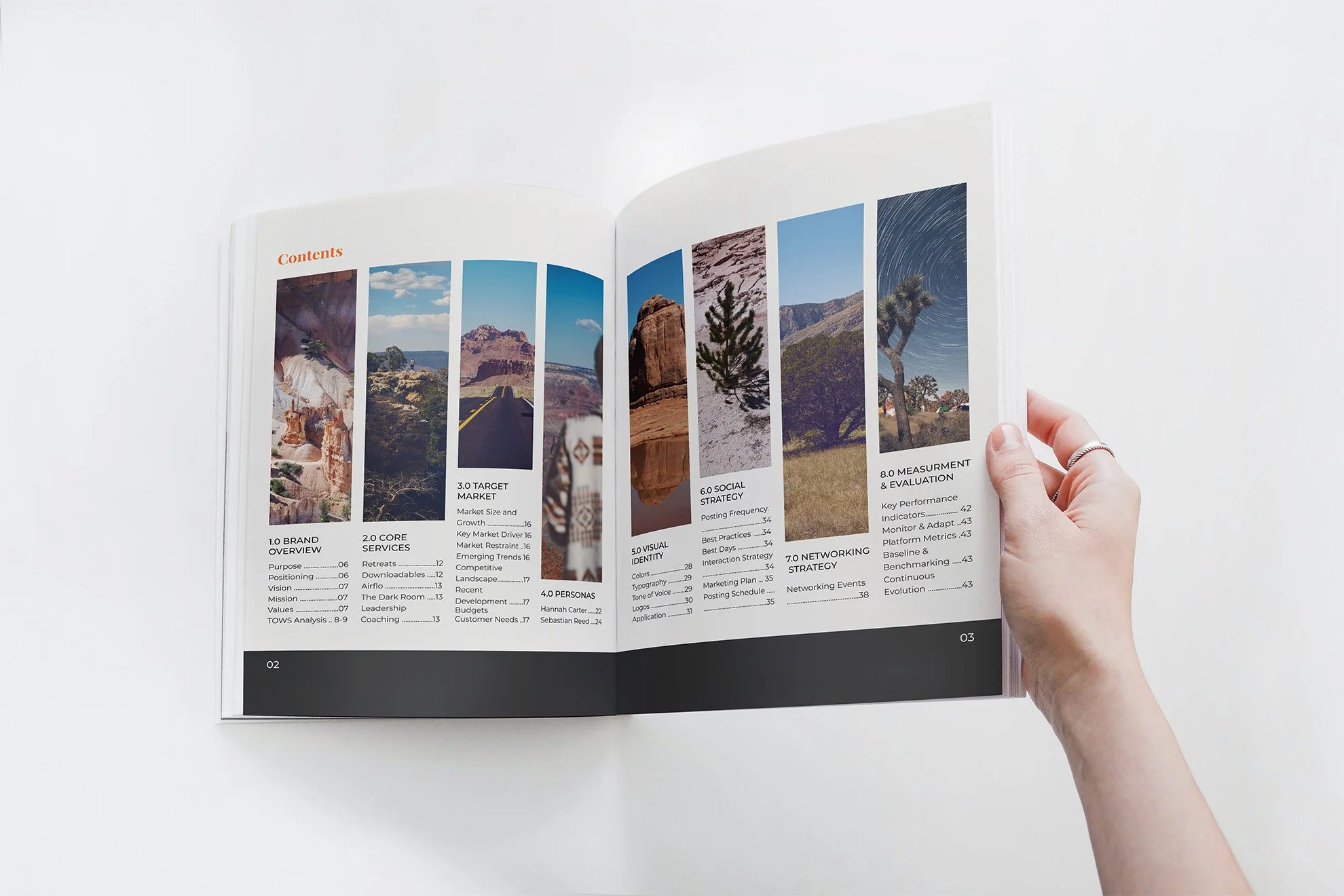
Blazing Pine Coaching helps leaders navigate complex roles, balancing work and life while gaining clarity and control over their direction. As their growth outpaced existing systems, we created a scalable strategy, redesigned their logo, built brand guidelines, and rebuilt their website.
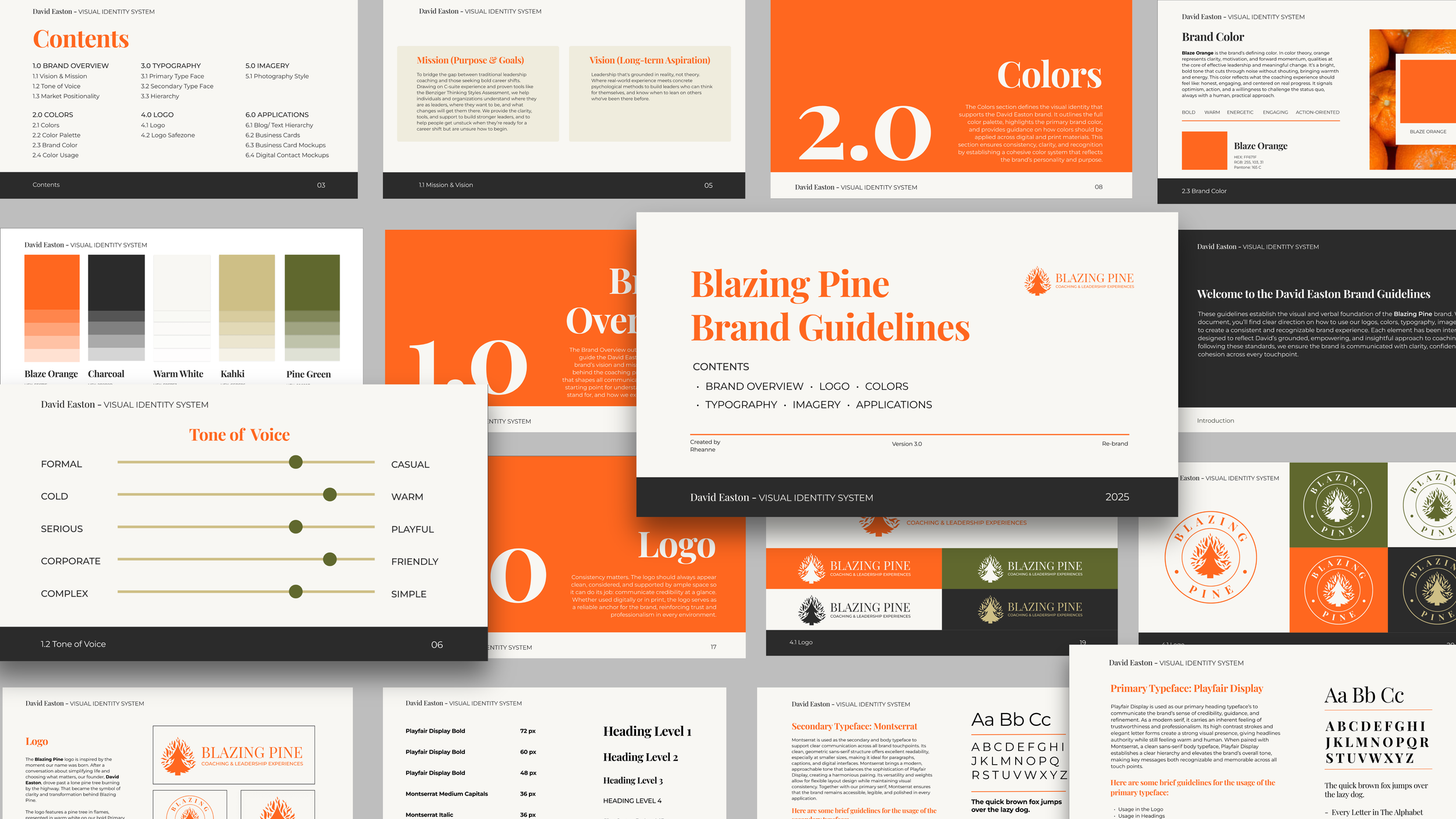
VISUAL IDENTITY
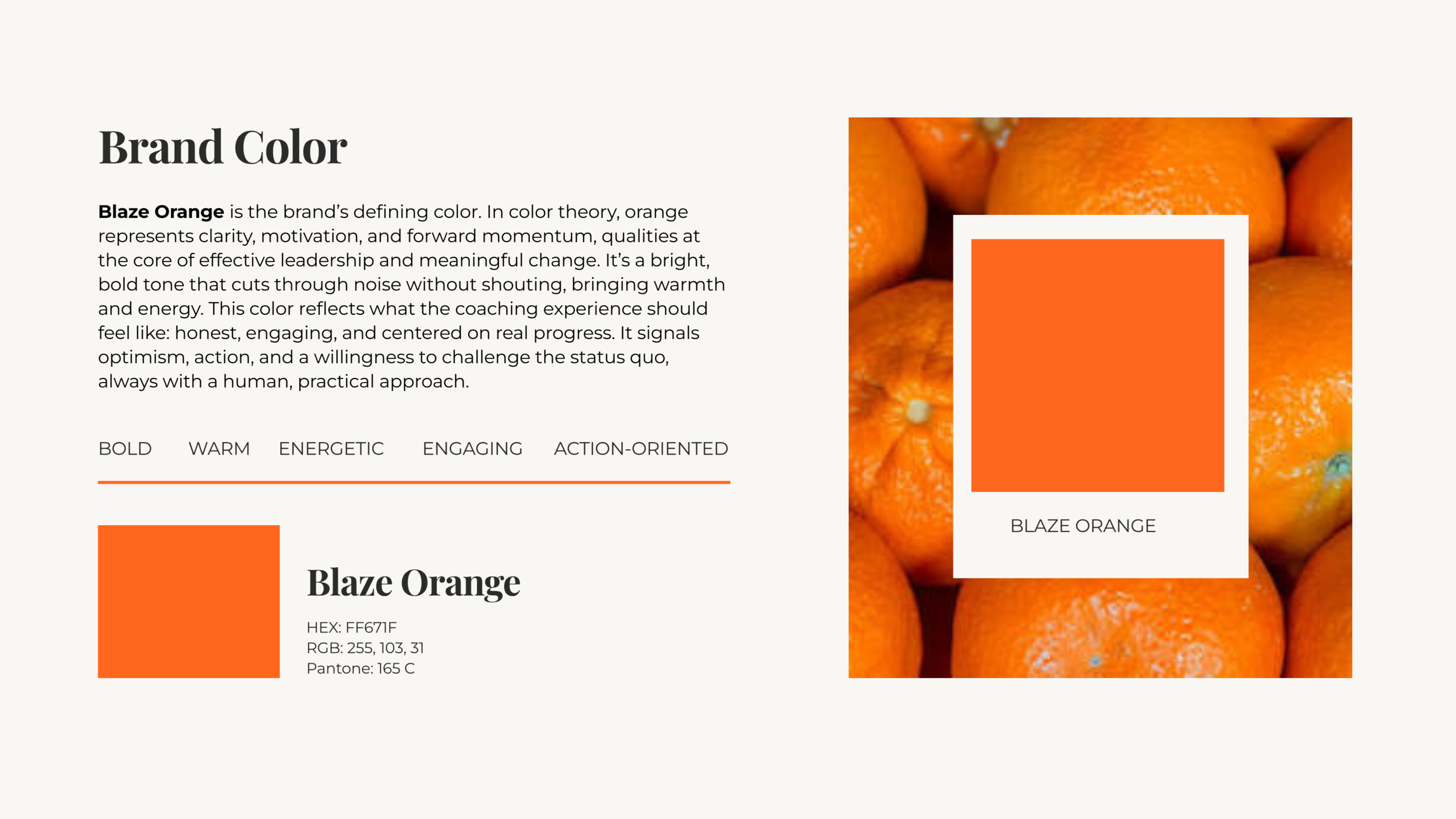
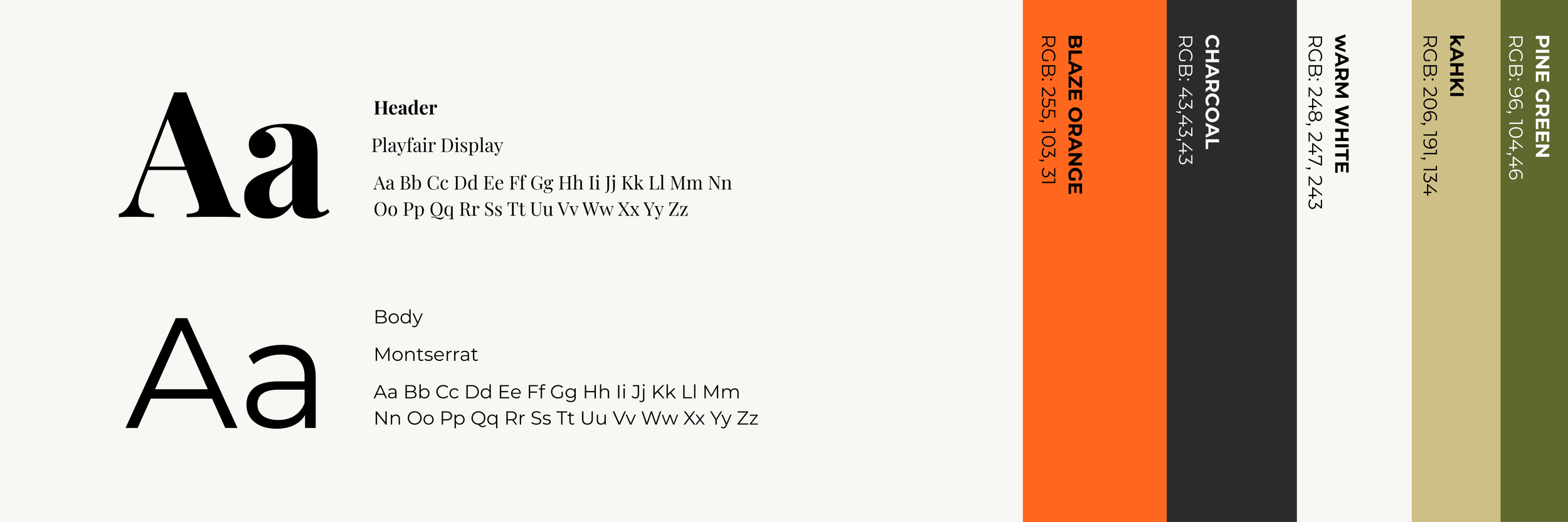
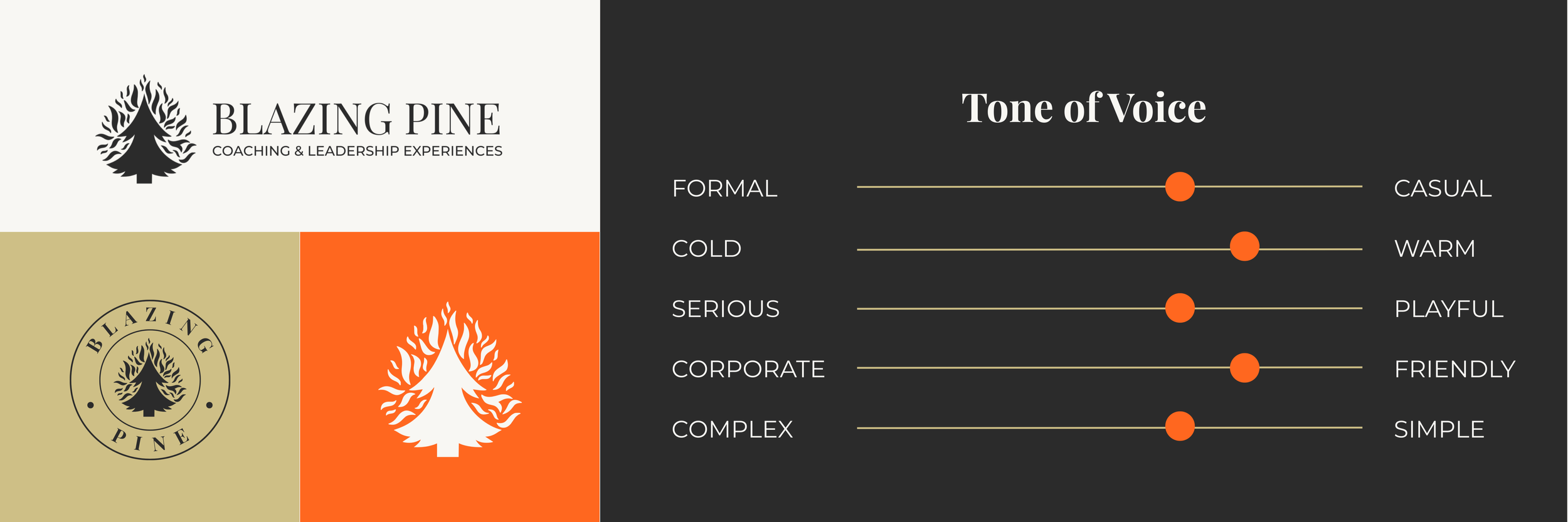
We started by creating a brand identity for Blazing Pine. The Primary Orange was the only requirement to incorporate while designing a trustworthy, energetic, and polished brand that can be applied in a clean, simple, yet bold way across digital and print.
-
The primary color, Blaze Orange, was a difficult color to fit into the brand. We didn’t want to come across as a hunting brand. We paired it with a warm white, charcoal, green and khaki to bring the bright orange back to earth tones.
-
We believe in keeping things simple, smart, and human. Every project starts with listening and ends with something we're proud to share.
-
From startups to seasoned brands, we partner with people who care about doing things right, and doing them well.
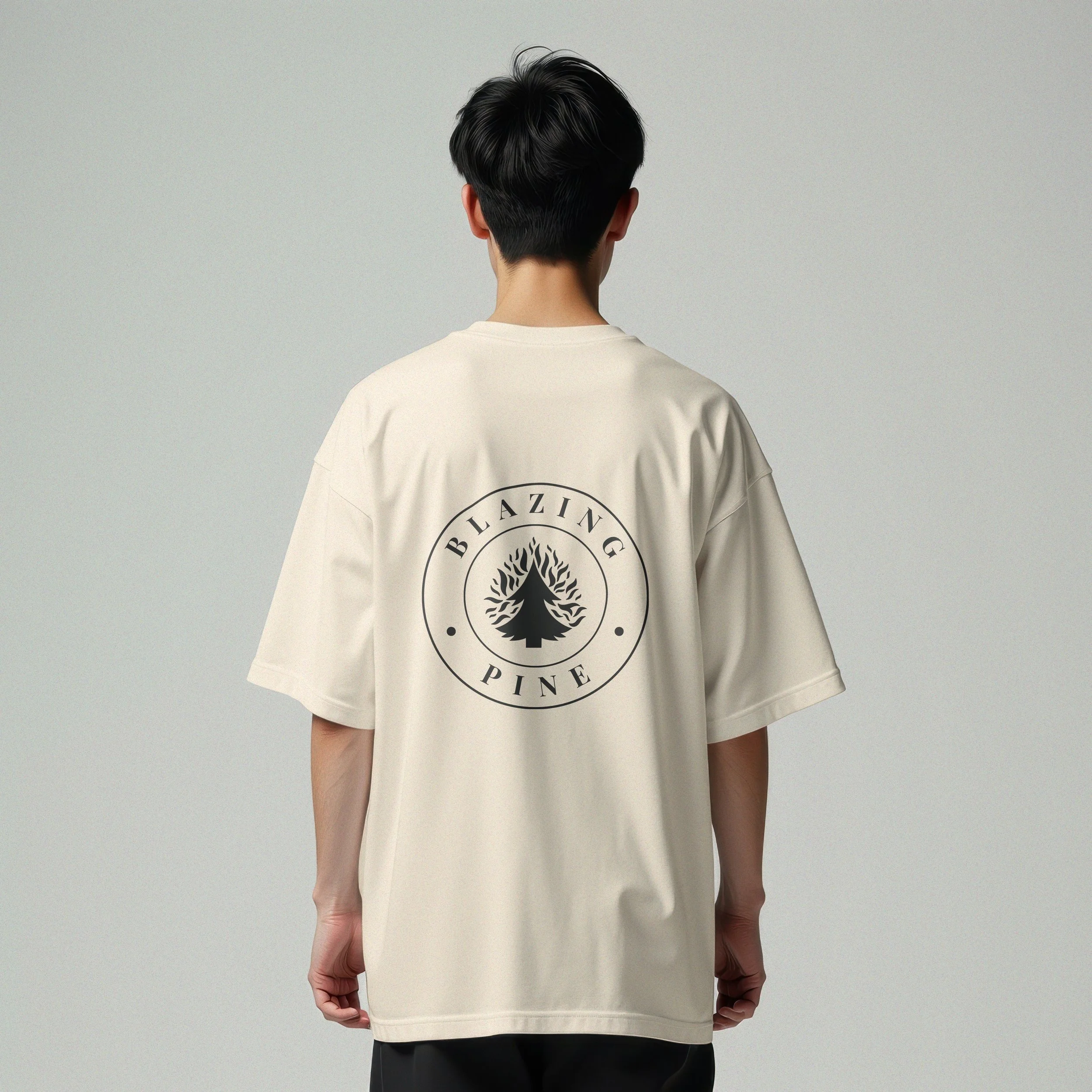
APPLICATION
OTHER PROJECTS WE THINK YOU’LL LOVE.
-
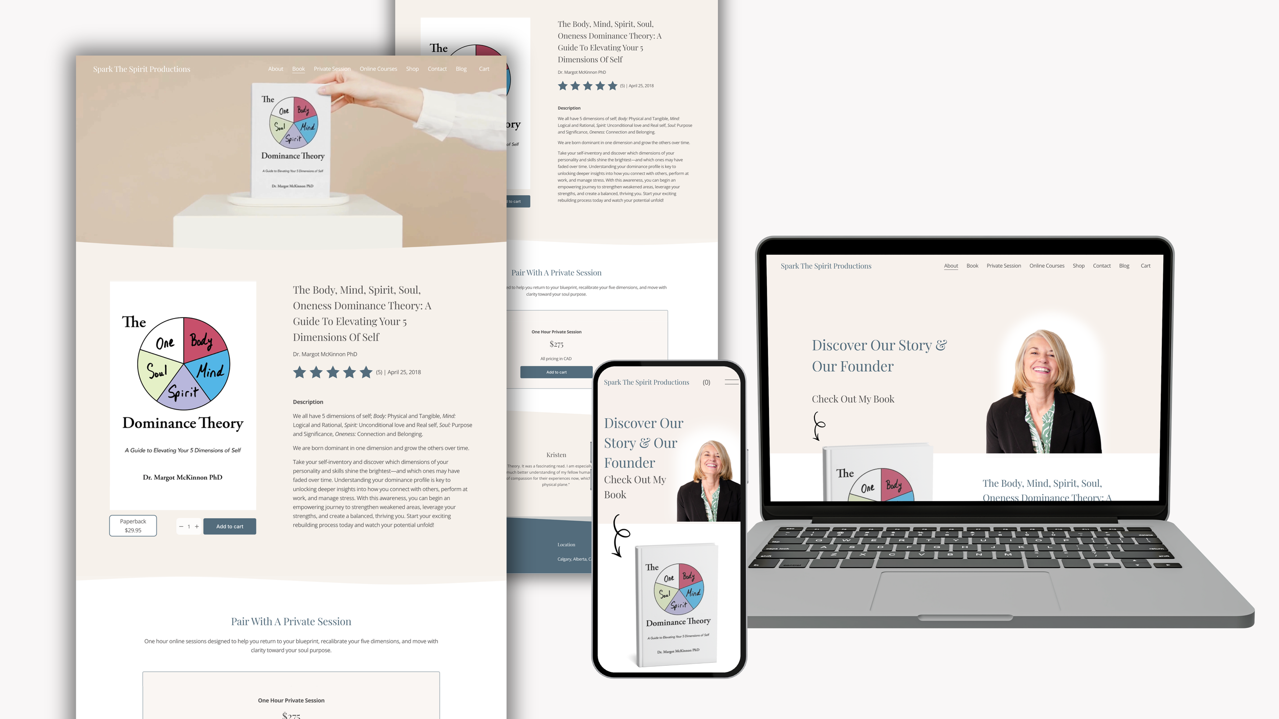
![Multiple digital devices and printed materials displaying a website about The Body, Mind, Spirit, Soul, and Oneness Dominance Theory, featuring a book cover with a circular diagram divided into five colored sections labeled Body, Mind, Spirit, Soul, and One.]()
SPARK THE SPIRIT PRODUCTIONS
-
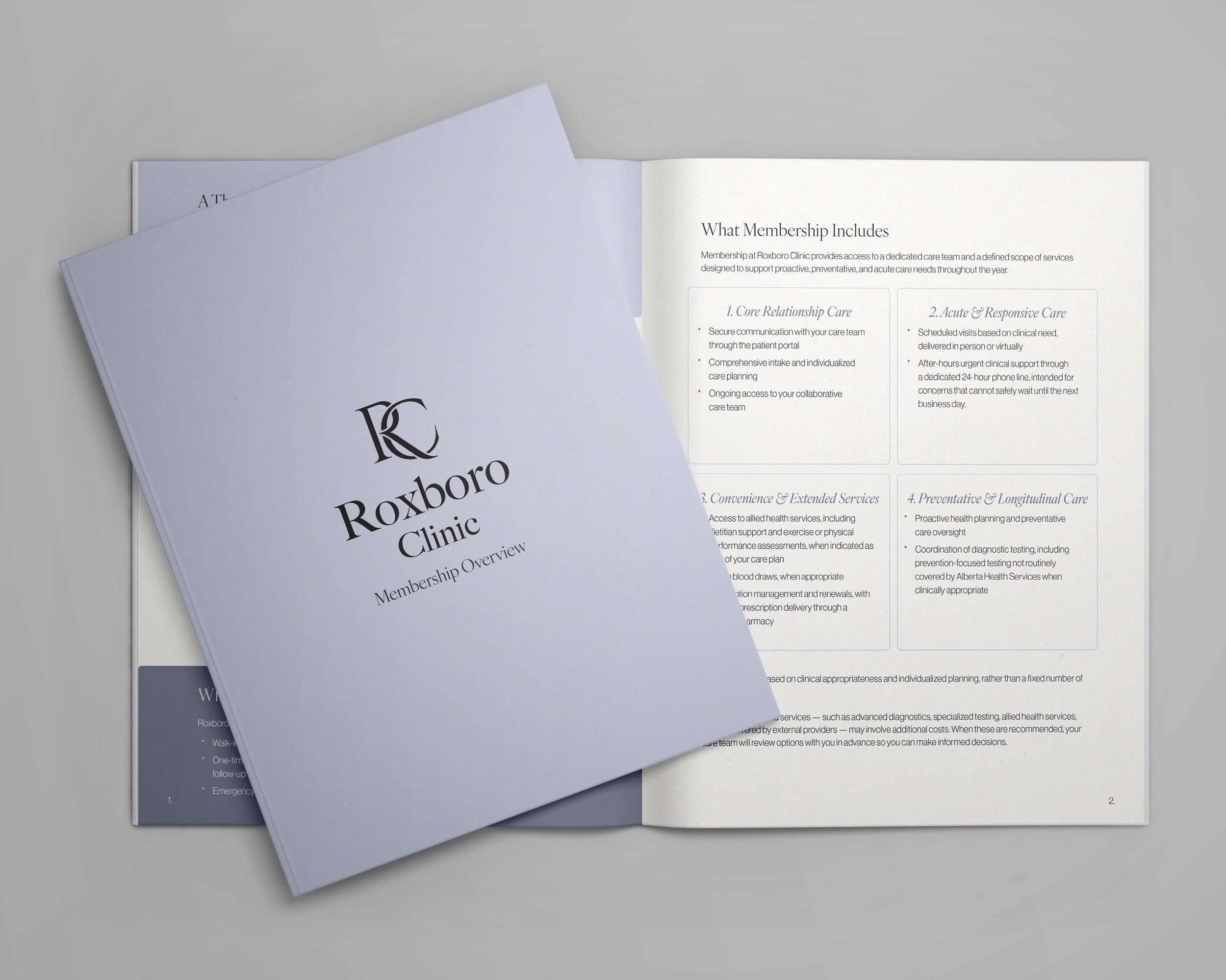
![Roxboro welcome document booklet mocokup]()
ROXBORO CLINIC
-
![Blue Rock Plumbing & Heating Logo on a background image of moraine lake]()
BLUEROCK PLUMBING & HEATING
-
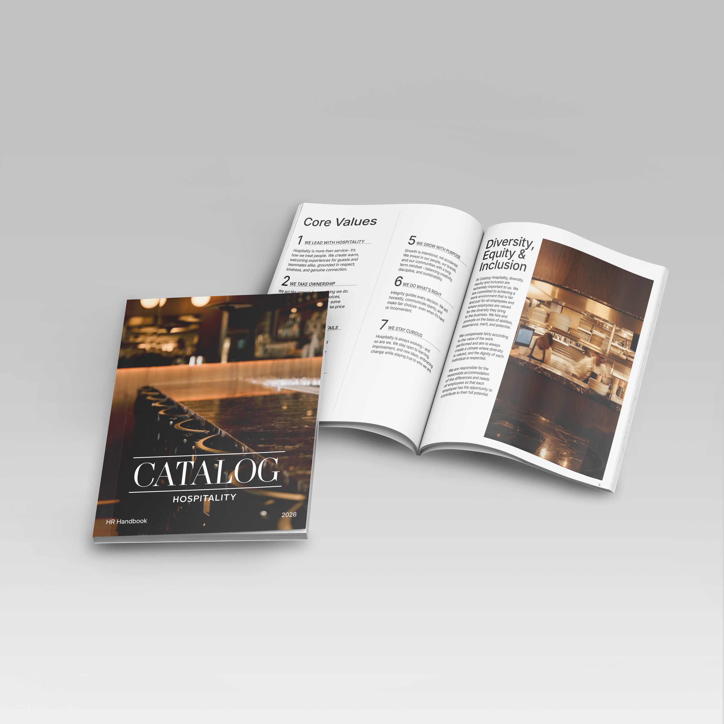
![Catalog Hospitality mockup]()
CATALOG HOSPITALITY